Plotting time series in Python with labels aligned to data
Randal Olson did a nice example of how to instead of a classic legend, put every label by their corresponding line. This is a nice technique when there are many labels. Having to always look at the legend makes interpretation hard.
Decided to extend upon his work making the alignment of the labels automatic, without them overlaping – and by leveraging Seaborn and Pandas for the plotting. Putting it here for future use and for others.
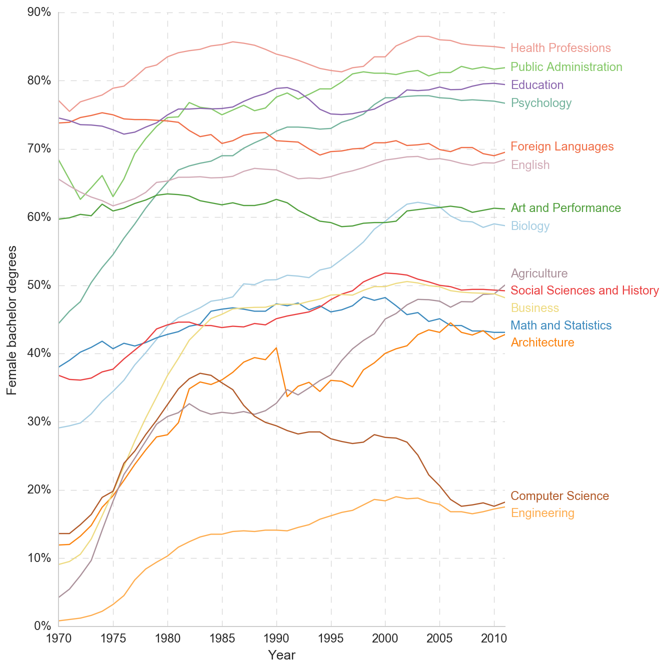
Results will be something like this:
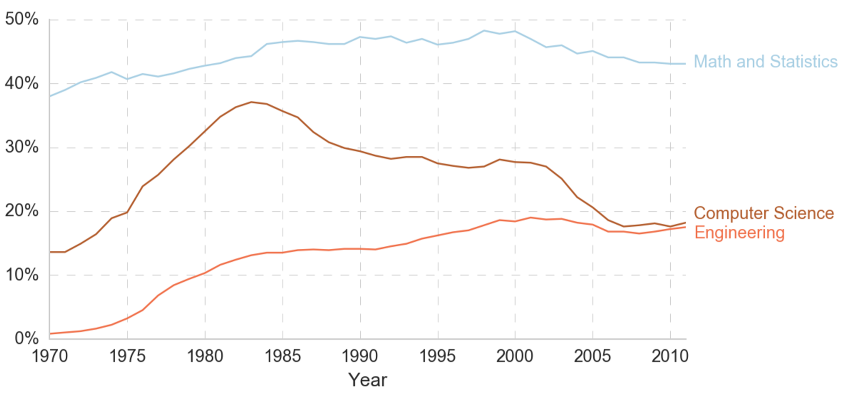
Now easy to mentally connect line with label
%matplotlib inline
%config InlineBackend.figure_formats = {'png', 'retina'}
import matplotlib.pyplot as plt
import seaborn as sns
import pandas as pd

# I like my plots on a white background
sns.set_context("notebook", font_scale=1.2, rc={"lines.linewidth": 1.2})
sns.set_style("whitegrid")
custom_style = {
            'grid.color': '0.8',
            'grid.linestyle': '--',
            'grid.linewidth': 0.5,
}
sns.set_style(custom_style)
df = pd.read_csv("https://raw.githubusercontent.com/maxberggren/legend-right/master/percent-bachelors-degrees-women-usa.csv")
Here’s my function taking care of aligning the text to the lines.
def legend_positions(df, y):
    """ Calculate position of labels to the right in plot... """
    positions = {}
    for column in y:
        positions[column] = df[column].values[-1] - 0.5

    def push():
        """
        ...by puting them to the last y value and
        pushing until no overlap
        """
        collisions = 0
        for column1, value1 in positions.iteritems():
            for column2, value2 in positions.iteritems():
                if column1 != column2:
                    dist = abs(value1-value2)
                    if dist < 2.5:
                        collisions += 1
                        if value1 < value2:
                            positions[column1] -= .1
                            positions[column2] += .1
                        else:
                            positions[column1] += .1
                            positions[column2] -= .1
                        return True
    while True:
        pushed = push()
        if not pushed:
            break

    return positions
And we are ready to plot!
x = 'Year'
y = ['Health Professions', 'Public Administration', 'Education',
     'Psychology', 'Foreign Languages', 'English',
     'Art and Performance', 'Biology', 'Agriculture',
     'Social Sciences and History', 'Business', 'Math and Statistics',
     'Architecture', 'Computer Science', 'Engineering']
positions = legend_positions(df, y)

f, ax = plt.subplots(figsize=(8,11))
cmap = plt.cm.get_cmap('Paired', len(y))

for i, (column, position) in enumerate(positions.items()):

    # Get a color
    color = cmap(float(i)/len(positions))
    # Plot each line separatly so we can be explicit about color
    ax = df.plot(x=x, y=column, legend=False, ax=ax, color=color)

    # Add the text to the right
    plt.text(
        df[x][df[column].last_valid_index()] + 0.5,
        position, column, fontsize=12,
        color=color # Same color as line
    )
ax.set_ylabel('Female bachelor degrees')
# Add percent signs
ax.set_yticklabels(['{:3.0f}%'.format(x) for x in ax.get_yticks()])
sns.despine()
UPDATE: Thanks /u/pybokeh for fix allowing for varying length of columns and for tip on Python 3.X compability.