Working with maps in Python
Kristoffer over at rpsychologist.com wrote a really nice tutorial on getting up to speed with maps in R. It looked something like this.
Felt a little left out, so I decided to make a port in Python. You can follow along below or if you prefer this as an Jupyter Notebook that you can download and run on our local machine.
To start with you need the packages numpy and matplotlib basemap. The latter should only be installed through Anaconda which is your, from here on, favorite Python package installer. So let’s load them up.
import numpy as np
import matplotlib.pyplot as plt
%matplotlib inline
from mpl_toolkits.basemap import Basemap
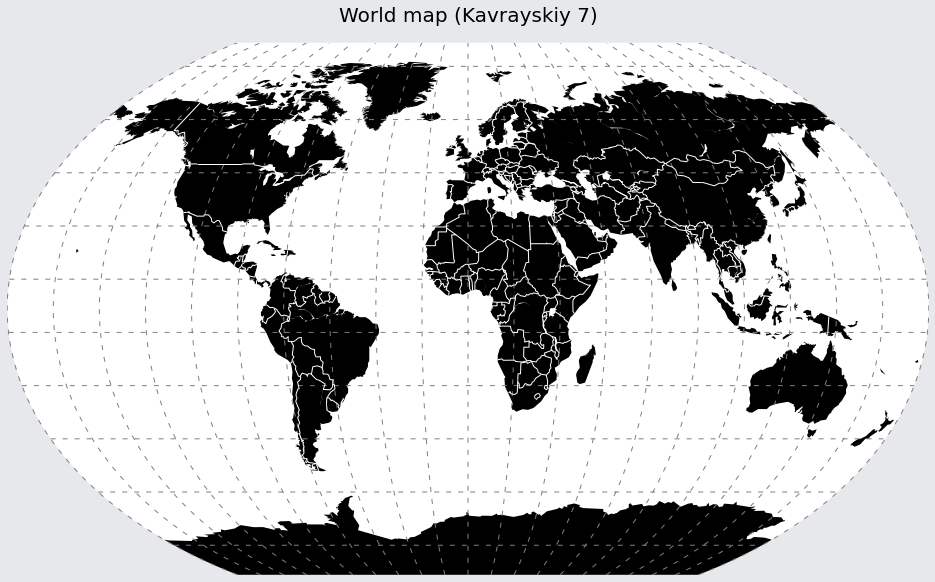
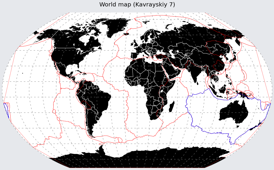
Kristoffer favored the Winkel tripel projection since it’s adapted by the National Geographic Society. But since it’s unfortunaly not avalible in Basemap, we use Kavrayskiy 7 (kav7), which is very very close. And by the way, Basemap supports 34 different projections so you will probably be able to find something that suits you.
m = Basemap(resolution='c',
            projection='kav7',
            lat_0=0., # Center around
            lon_0=0.) # lat 0, lon 0
Kristoffer used graticlues (the grid) from a shapefile, Basemap handles this for us so let’s prepare what it need.
n_graticules = 18
parallels = np.arange(-80., 90, n_graticules)
meridians = np.arange(0., 360., n_graticules)
lw = 1
dashes = [5,7] # 5 dots, 7 spaces... repeat
graticules_color = 'grey'
The rest should be quite self explainatory.
fig1 = plt.figure(figsize=(16,20))
fig1.patch.set_facecolor('#e6e8ec')
ax = fig1.add_axes([0.1,0.1,0.8,0.8])

m.drawmapboundary(color='white',
                  linewidth=0.0,
                  fill_color='white')
m.drawparallels(parallels,
                linewidth=lw,
                dashes=dashes,
                color=graticules_color)
m.drawmeridians(meridians,
                linewidth=lw,
                dashes=dashes,
                color=graticules_color)
m.drawcoastlines(linewidth=0)
m.fillcontinents('black',
                 lake_color='white')
m.drawcountries(linewidth=1,
                linestyle='solid',
                color='white',
                zorder=30)

title = plt.title('World map (Kavrayskiy 7)',
                  fontsize=20)
title.set_y(1.03) # Move the title a bit for niceness
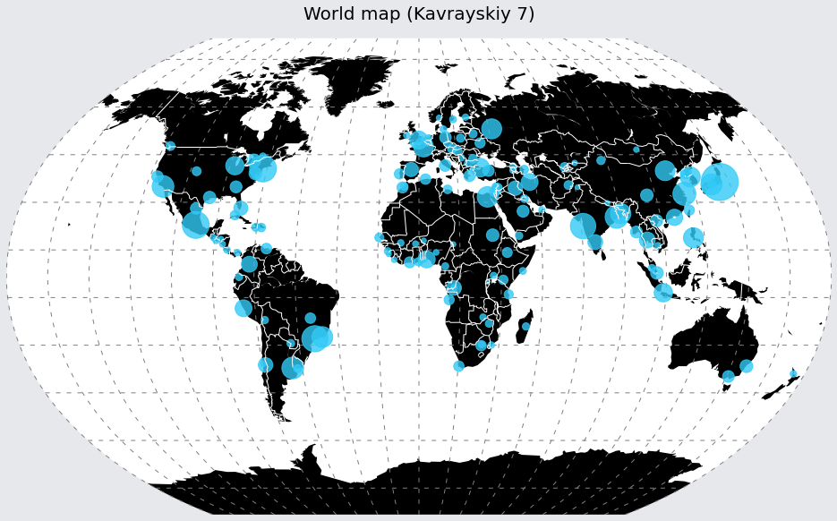
Let’s add some shapefiles. Basemap does this nicely for us with readshapefile and we use the same as Kristoffer found here. Since we named it populated_places, m.populated_places_info will hold all data. For some shapefiles this means statistics and all sorts of nice things so be sure to check m.yourname_info out.
We use m.scatter to make the bubble plot.
m.readshapefile('shapefiles/ne_110m_populated_places/ne_110m_populated_places',
                name='populated_places',
                drawbounds=False,
                color='none')

populations = [r['POP2000'] for r in m.populated_places_info]
lats = [r['LATITUDE'] for r in m.populated_places_info]
lons = [r['LONGITUDE'] for r in m.populated_places_info]
x1, y1 = m(lons, lats) # Convert coords to projected place in figure
m.scatter(x1, y1,
          s=np.array(populations)*0.05,
          marker="o",
          color='#32caf6',
          zorder=10,
          alpha=0.8)
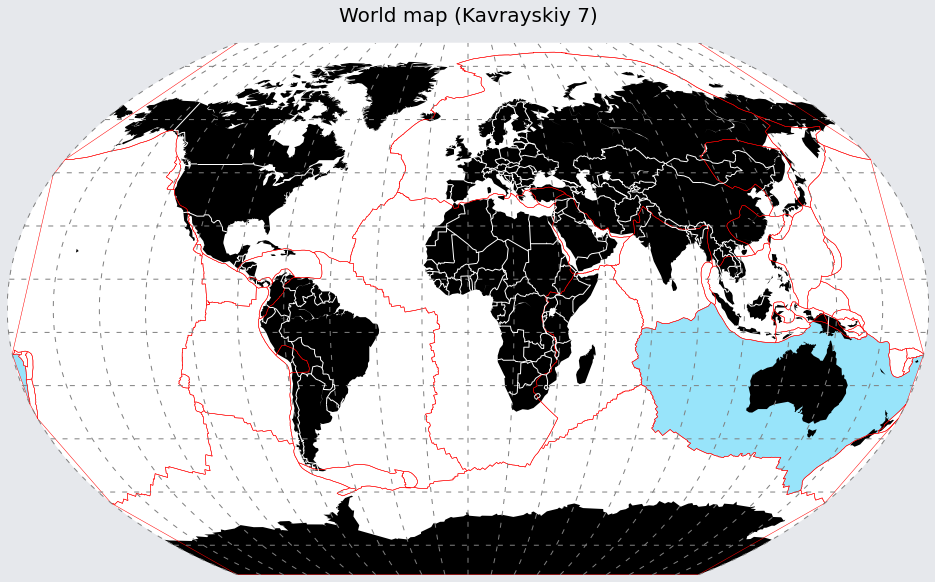
But most likely a shapefile will contain a shape that you want to put on your map. Let’s put out the borders of the tectonic plates on our map. The tectonic plate shapefile can be found here.
m.readshapefile('shapefiles/tectonicplates-master/PB2002_plates',
                name='tectonic_plates',
                drawbounds=True,
                color='red')
But you’ll probably also want to have control over the settings of the shapes e.g. color the Australia plate in a different way
for info, shape in zip(m.tectonic_plates_info,
                       m.tectonic_plates):

    if info['PlateName'] == "Australia":
        x, y = zip(*shape)
        m.plot(x, y, marker=None, color='b')
And perhaps you also want to fill the patch.
from matplotlib.patches import Polygon
from matplotlib.collections import PatchCollection
from matplotlib.patches import PathPatch

patches = []
for info, shape in zip(m.tectonic_plates_info,
                       m.tectonic_plates):

    if info['PlateName'] == "Australia":
        patches.append(Polygon(np.array(shape), True))

ax.add_collection(PatchCollection(patches,
                                  facecolor='#32caf6',
                                  edgecolor='none',
                                  linewidths=1.,
                                  alpha=0.5,
                                  zorder=1))